Testimonial Design: 15 Layouts That Convert (+ Free Templates)
Updated
On this page
- The four testimonial layout families
- 15 testimonial designs, live
- 1. Classic three-column card grid
- 2. Masonry wall of love
- 3. Metric-led cards
- 4. Logo and quote cards for B2B
- 5. Bento grid with one featured quote
- 6. Social post card
- 7. Swipeable card carousel
- 8. Single-slide quote carousel
- 9. Scrolling marquee
- 10. Left-aligned hero quote
- 11. Split layout: photo and quote
- 12. Quote beside the price
- 13. Video grid with captions
- 14. Featured video with text quotes
- 15. Vertical short-form video strip
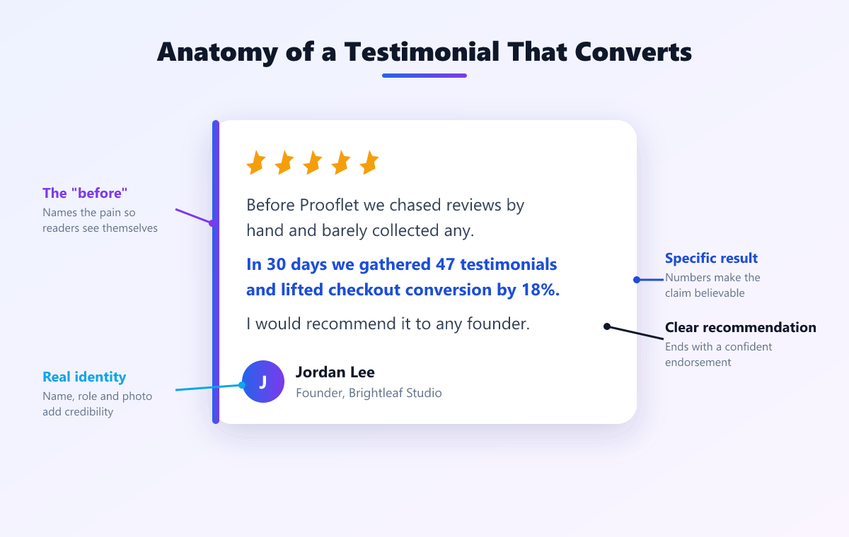
- Anatomy of a converting testimonial card
- Free testimonial design templates
- Template 1: Card grid
- Template 2: Carousel
- Template 3: Hero quote
- Common testimonial design mistakes
- Build these without writing code
- Frequently Asked Questions
Testimonial design comes down to four layout families: the card grid, the carousel, the single hero quote, and the video wall. Card grids suit dedicated testimonial pages, carousels suit homepages where space is tight, hero quotes suit landing pages with one strong customer, and video walls suit products where the buyer needs to see a real person. Whichever you pick, three elements do the persuading: a face, a full name with role and company, and one specific number.
In short: testimonial design has four layout families: card grid, carousel, single hero quote, and video wall. A converting testimonial card contains six elements: photo, full name, role, company, the quote itself, and one specific number.
Every example below is a live, working layout built in plain HTML and CSS, so you can resize the window and watch each one respond. The names and companies are placeholders. The free templates for three of them are further down, ready to copy or download.
The four testimonial layout families
| Layout family | Best for | Testimonials shown | Why it works |
|---|---|---|---|
| Card grid | A dedicated testimonials page or wall of love | 6 to 30+ | Scales to any number and reads as volume |
| Carousel | A homepage section where vertical space is tight | 4 to 10 | Many quotes in the height of one |
| Hero quote | A landing page with one standout customer | 1 | One specific story, set large, near the headline |
| Video wall | Products where the buyer needs to see a real person | 3 to 12 | Face and voice make it hard to fake |
Choose the family by the page first and the look second. A hero quote on a wall of love wastes 29 testimonials, and a 30-card grid on a homepage pushes everything else below the fold.
15 testimonial designs, live
Each design is labelled with its layout family. Swipe the carousels on a phone or scroll them sideways with a trackpad.
1. Classic three-column card grid
We went from one testimonial a quarter to 34 in six weeks.
Setup took ten minutes. Our pricing page converts 22% better.
Support replies in under an hour, every time. Renewed for year three.
Why it works: The default for a dedicated testimonials page. Equal cards read as equal evidence, and the grid collapses to one column on a phone without extra work.
2. Masonry wall of love
Our close rate went from 33% to 51% after we added client videos to proposals.
We went from one testimonial a quarter to 34 in six weeks.
Replaced three tools and saved $1,200 a month.
Setup took ten minutes. Our pricing page converts 22% better.
Onboarding dropped from three weeks to four days.
Support replies in under an hour, every time. Renewed for year three.
Why it works: Masonry lets long and short quotes sit together without awkward gaps, which is why most wall of love pages use it. Volume is the message: 20 or more cards say that many people are happy.
3. Metric-led cards
testimonials in six weeks
We went from one testimonial a quarter to 34 in six weeks.
higher pricing page conversion
Setup took ten minutes. Our pricing page converts 22% better.
saved every month
Replaced three tools and saved $1,200 a month.
Why it works: Leading with the number means a skimming visitor gets the proof without reading the quote. Use it only when every card has a real number; one card without a metric looks weak beside the others.
4. Logo and quote cards for B2B
We went from one testimonial a quarter to 34 in six weeks.
Setup took ten minutes. Our pricing page converts 22% better.
Support replies in under an hour, every time. Renewed for year three.
Why it works: B2B buyers look for a company like theirs before they read the words. A logo at the top of each card answers that question first.
5. Bento grid with one featured quote
We went from one testimonial a quarter to 34 in six weeks, and the pricing page converts 22% better than it did in Q1.
Setup took ten minutes. Our pricing page converts 22% better.
Support replies in under an hour, every time. Renewed for year three.
Why it works: One large card gives the page a clear starting point, and the smaller cards back it up. Put your strongest, most specific quote in the large slot.
6. Social post card
ok the new testimonial wall is live and we already got 3 demo requests that mention it. wild.
Posted on X · Aug 14Genuinely the fastest setup of any tool we bought this year. Ten minutes, start to finish.
Posted on X · Aug 14Why it works: Keeping the handle, the platform and the date makes the post checkable, and checkable proof reads as real. Keep the original casing and typos.
7. Swipeable card carousel
We went from one testimonial a quarter to 34 in six weeks.
Setup took ten minutes. Our pricing page converts 22% better.
Support replies in under an hour, every time. Renewed for year three.
Our close rate went from 33% to 51% after we added client videos to proposals.
Why it works: Fits four or more testimonials into the height of one card, which is why it suits a homepage. It scrolls with a swipe or a trackpad and needs no JavaScript.
8. Single-slide quote carousel
Our close rate went from 33% to 51% after we added client videos to proposals.
Onboarding dropped from three weeks to four days.
Setup took ten minutes. Our pricing page converts 22% better.
Why it works: One quote at a time, full width. It works in a narrow hero or sidebar. Never auto-advance faster than the quote can be read: roughly one second per four words, so a 24-word quote needs at least six seconds.
9. Scrolling marquee
We went from one testimonial a quarter to 34 in six weeks.
Setup took ten minutes. Our pricing page converts 22% better.
Support replies in under an hour, every time. Renewed for year three.
Our close rate went from 33% to 51% after we added client videos to proposals.
Replaced three tools and saved $1,200 a month.
Onboarding dropped from three weeks to four days.
We went from one testimonial a quarter to 34 in six weeks.
Setup took ten minutes. Our pricing page converts 22% better.
Support replies in under an hour, every time. Renewed for year three.
Our close rate went from 33% to 51% after we added client videos to proposals.
Replaced three tools and saved $1,200 a month.
Onboarding dropped from three weeks to four days.
Why it works: A slow, continuous strip that signals volume at a glance. Pause it on hover so people can read a card, and stop it entirely for visitors who have reduced motion turned on. This demo does both.
10. Left-aligned hero quote
“Our close rate went from 33% to 51% after we started opening every proposal with a 40 second client video.”
Why it works: One strong customer, set large, directly under the headline. Left-aligned upright text reads faster than centred italics, and the photo makes it a person rather than a slogan.
11. Split layout: photo and quote
“Onboarding dropped from three weeks to four days. New hires are productive in their first week now, not their fourth.”
Why it works: A large photo gives the quote a face at the size of a product screenshot. It suits a landing page built around one named customer or a case study teaser.
12. Quote beside the price
Pro
$99 one-time
Get Pro“Paid for itself in the first month.” Raj Kapoor, Founder, Brightfield
Why it works: The price is where buyers hesitate, so the proof sits right there. Pick a quote about value or payback, not about features.
13. Video grid with captions
“Our close rate went from 33% to 51%.” Tom Baker, Northgate Studio
“34 testimonials in six weeks.” Dana Whitfield, Lumen Labs
“Replaced three tools.” Sara Okafor, Pinecrest
Why it works: The caption carries the key line, so the video persuades even before anyone presses play. Show the duration: buyers press play on a 45 second clip, not an unknown length.
14. Featured video with text quotes
“Onboarding dropped from three weeks to four days.” Jon Park, COO, Relay Freight
Setup took ten minutes. Our pricing page converts 22% better.
Support replies in under an hour, every time. Renewed for year three.
Why it works: One video anchors the section and two text quotes back it up for people who will not press play. It gives you video's credibility without asking every visitor to watch.
15. Vertical short-form video strip
Dana, Lumen Labs
Raj, Brightfield
Maya, Harbor & Co
Tom, Northgate
Why it works: Phone-recorded 9:16 clips look native on mobile and on social. Customers record them in one take, so they are easier to collect than a produced video.
Anatomy of a converting testimonial card
Strip any of the designs above down to one card and the same six elements do the work. Remove one and the card loses credibility.
5 “Onboarding dropped from three weeks to four days 6. New hires are productive in their first week now.”
- Photo. A real face, not a logo or a stock image. It is the fastest signal that a real person said this.
- Full name. First and last. “Sarah K.” reads as invented.
- Role. Lets the reader judge whether this person's problem matches theirs.
- Company. Proves the role exists somewhere real, and in B2B, signals the size of customer you serve.
- The quote. Two to four sentences in the customer's own words, left-aligned and upright.
- One specific number. “22% higher conversion” or “four days instead of three weeks.” Highlight it so a skimmer sees it without reading the sentence.
- Source badge (optional). A G2, Google, or X badge with the star rating tells the reader the quote can be checked.
Free testimonial design templates
Three of the layouts above as plain HTML and CSS: the card grid, the carousel, and the hero quote. No JavaScript, no framework, no dependencies. Copy the snippets below, or download all three as one HTML file and open it in a browser.
Template 1: Card grid
CSS
.t-grid {
  display: grid;
  gap: 16px;
  grid-template-columns: repeat(auto-fit, minmax(240px, 1fr));
}
.t-card {
  display: flex;
  flex-direction: column;
  gap: 12px;
  padding: 20px;
  border: 1px solid #e5e7eb;
  border-radius: 12px;
  background: #fff;
}
.t-quote { margin: 0; font-size: 16px; line-height: 1.55; color: #111827; }
.t-metric { font-weight: 700; color: #047857; }
.t-person { display: flex; align-items: center; gap: 12px; }
.t-person img { width: 44px; height: 44px; border-radius: 50%; object-fit: cover; }
.t-name { display: block; font-weight: 600; font-size: 15px; color: #111827; }
.t-role { display: block; font-size: 14px; color: #6b7280; }
HTML
<div class="t-grid">
  <figure class="t-card">
    <blockquote class="t-quote">
      Onboarding dropped from <span class="t-metric">three weeks to four days</span>.
    </blockquote>
    <figcaption class="t-person">
      <img src="photo.jpg" alt="Jon Park" width="44" height="44">
      <span>
        <span class="t-name">Jon Park</span>
        <span class="t-role">COO, Relay Freight</span>
      </span>
    </figcaption>
  </figure>
  <!-- repeat .t-card for each testimonial -->
</div>
Template 2: Carousel
CSS
.t-track {
  display: flex;
  gap: 16px;
  overflow-x: auto;
  scroll-snap-type: x mandatory;
  padding-bottom: 8px;
}
.t-track > .t-card {
  flex: 0 0 80%;
  max-width: 320px;
  scroll-snap-align: start;
}
/* .t-card, .t-quote, .t-person as in the card grid template */
HTML
<div class="t-track" tabindex="0" aria-label="Customer testimonials">
  <figure class="t-card">...</figure>
  <figure class="t-card">...</figure>
  <figure class="t-card">...</figure>
</div>
Template 3: Hero quote
CSS
.t-hero { max-width: 640px; }
.t-hero .t-quote {
  margin: 0 0 20px;
  font-size: clamp(20px, 3vw, 26px);
  line-height: 1.4;
  font-weight: 500;
  color: #111827;
}
.t-hero .t-person img { width: 56px; height: 56px; }
HTML
<figure class="t-hero">
  <blockquote class="t-quote">
    "Our close rate went from 33% to 51% after we started opening
    every proposal with a 40 second client video."
  </blockquote>
  <figcaption class="t-person">
    <img src="photo.jpg" alt="Tom Baker" width="56" height="56">
    <span>
      <span class="t-name">Tom Baker</span>
      <span class="t-role">Founder, Northgate Studio</span>
    </span>
  </figcaption>
</figure>
The templates use <figure>, <blockquote>, and <figcaption>, so screen readers announce the quote and the person it belongs to. Set a width and height on every photo so the layout does not shift while images load.
Common testimonial design mistakes
- Centred italic text. Both slow reading down, and together they make a quote look like decoration. Left-align it and keep it upright.
- No photos. A wall of text quotes with initials or a generic icon reads as invented. A real photo does more for credibility than any other single element.
- Identical five-star ratings. Twenty cards with five stars each look curated. A few 4-star reviews that mention a small complaint make the rest believable.
- Fast auto-advancing carousels. A slide that moves on before the visitor finishes reading is worse than no carousel. Allow one second per four words, pause on hover, and respect reduced motion.
- Stock photos. Visitors recognise them, and one recognised stock photo discredits every testimonial on the page.
- Truncated quotes with “read more”. If the quote needs a click to make sense, it is the wrong quote for a card. Pick a shorter one.
Build these without writing code
The templates above are free and static: you paste in each testimonial by hand and update the HTML whenever a new one arrives. Prooflet renders the same card grid, carousel, wall of love, and floating badge layouts from one line of embed code, and every widget updates automatically when you approve a new testimonial. The widget loads in under 50ms, so it does not slow the page down. See the testimonial widget, browse wall of love examples, or read where to place testimonials on your website.
Frequently Asked Questions
1. What is the best testimonial design?
The best design depends on the page. Use a card grid for a dedicated testimonials page, a carousel for a homepage where space is tight, a single hero quote on a landing page with one standout customer, and a video wall when buyers need to see a real person. Every layout needs a photo, a full name with role and company, and one specific number.
2. What should a testimonial card include?
Six elements: a photo, the person's full name, their role, their company, the quote itself, and one specific number such as a percentage, a time saved, or a revenue figure. A source badge, such as a G2 or Google logo with a star rating, is an optional seventh element that makes the quote checkable.
3. Should testimonial carousels auto-play?
Only slowly, and never without a pause. Allow at least one second per four words, so a 24-word quote stays on screen for six seconds or more. Pause on hover and focus, and stop the motion entirely for visitors with reduced motion turned on in their system settings.
4. Are these testimonial templates free to use?
Yes. The three templates on this page, card grid, carousel, and hero quote, are plain HTML and CSS with no JavaScript and no dependencies. Download the file, replace the placeholder names, photos, and quotes with your own customers, and use them on any site.