Testimonials on Your Website: Where to Put Them (12 Examples)
Updated

On this page
- The three highest-converting places for testimonials
- 1. Directly below the homepage hero
- 2. Next to the price on the pricing page
- 3. Adjacent to the submit button
- How many testimonials to show, by page type
- Which format works in each placement
- 12 examples of testimonials on websites
- 1. Homepage: one quote directly below the hero
- 2. Homepage: rating badge under the call to action
- 3. Homepage: logos with one named quote
- 4. Feature section: proof beside the claim
- 5. Pricing page: quote beside the price
- 6. Pricing page: a switching testimonial above the table
- 7. Checkout: one short quote next to the pay button
- 8. Signup form: rating beside the submit button
- 9. Landing page: three quotes, one per claim
- 10. Product page: star rating next to the price
- 11. Dedicated page: a wall of love
- 12. Any page: a floating badge in the corner
- What kills a testimonial
- Keep testimonials from slowing your site
- Testimonials on website templates
- How to write testimonials for your website
- How to add testimonials to your website
- Frequently Asked Questions
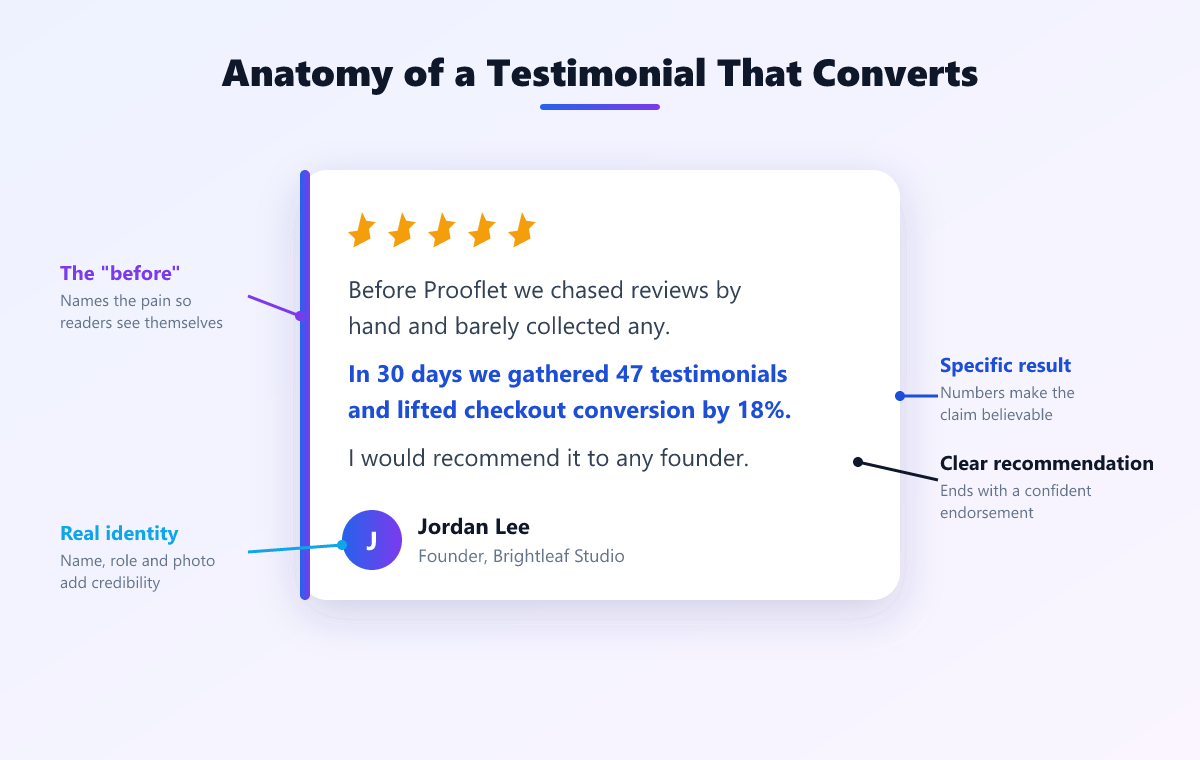
Testimonials work hardest in three places: immediately below the hero on your homepage, next to the price on your pricing page, and adjacent to the submit button on any form or checkout. Show three to five on a homepage and link to a full wall of love for the rest. Every testimonial should carry a real name, a photo, and one specific outcome. Unattributed quotes are read as fabricated and can perform worse than no testimonial at all.
In short: testimonials convert best in three places: below the homepage hero, beside the price on a pricing page, and next to the submit button at checkout. Show three to five per page. Every testimonial needs a real name, a photo, and one specific measurable outcome.
Most websites with good testimonials still hide them in one carousel near the bottom of the homepage, below the point most visitors stop scrolling. Below: the three placements that matter, how many to show on each page type, 12 placement examples, and what makes a testimonial look fake.
The three highest-converting places for testimonials
A testimonial works when it answers the doubt a visitor has at that moment. Three moments carry the most doubt.
1. Directly below the homepage hero
Your headline makes a promise. The first thing a visitor reads after it should be a customer confirming it. Use one short quote from a customer who resembles your target buyer, readable in five seconds. A rating badge under the call to action does the same job in less space.
2. Next to the price on the pricing page
Hesitation peaks at the price. Place two or three testimonials beside or directly above the pricing table, and choose ones about value, payback, or how painless it was to switch from another tool. A comparison testimonial here answers the objection at the moment it forms.
3. Adjacent to the submit button
Checkout, signup, and demo request forms are the last point of doubt before a conversion. One short quote or a rating badge beside the button reassures without distracting. Anything that competes with the button, such as a video or an autoplaying carousel, costs more attention than it earns.
Two more placements matter once those three are covered: next to the claim a testimonial proves (the quote about fast setup beside your setup copy), and a dedicated testimonials page for everything else, usually at /testimonials or /wall-of-love. See our wall of love examples for how the best dedicated pages are laid out.
How many testimonials to show, by page type
| Page type | How many | Format | Why |
|---|---|---|---|
| Homepage | 3 to 5 | One quote or a carousel directly below the hero | Confirms the headline's promise, then links to the full wall |
| Pricing page | 2 to 3 | Short quotes beside the price | Answers the cost and switching objections |
| Landing page | 3 | One quote beside each claim | Each testimonial proves one point |
| Product page (ecommerce) | Rating plus reviews | Star rating next to the price, reviews below | Shoppers check the rating before they read |
| Checkout or signup | 1 | One short quote or a rating badge | Reassures without competing with the button |
| Testimonials page | 12+ | Grid or masonry wall of love | Volume is the message |
On pages built to convert, fewer is better: three to five specific testimonials beat fifteen generic ones, because each extra quote takes attention from your call to action. On the page built to reassure, more is better: a wall of love starts to work at 12 testimonials, and below that a grid or carousel reads better. With fewer than five testimonials in total, place them beside the claims they prove and skip the dedicated page until you have more.
Which format works in each placement
- Below the hero: a single quote, or a slow carousel when you have four or more strong ones.
- Beside the price: two or three short quotes, stacked or side by side.
- At checkout: one line of text or a rating badge. Never video.
- On a dedicated page: a grid or masonry wall, with video testimonials mixed in.
- Site-wide: a small floating badge, for pages with no room for a section.
For 15 live layouts of each format, see our testimonial design examples.
12 examples of testimonials on websites
Each example below is a wireframe of one placement, with the testimonial highlighted in blue. They are Prooflet illustrations of common patterns, not screenshots of specific sites.
1. Homepage: one quote directly below the hero
“Set up in ten minutes. Our pricing page converts 22% better.”Raj Kapoor, Founder, Brightfield
Why it works: The first thing a visitor reads after your promise is a customer confirming it. One quote, not a carousel, so it is read rather than skipped.
2. Homepage: rating badge under the call to action
4.9 from 312 reviewsGoogle and G2
Why it works: When the hero has no room for a quote, a rating badge does the same job in one line. Link it to the source so the number can be checked.
3. Homepage: logos with one named quote
“Onboarding dropped from three weeks to four days.”Jon Park, COO, Relay Freight
Why it works: A logo row shows who uses you; the quote under it shows what changed for one of them. B2B sites need both, because logos alone say nothing about results.
4. Feature section: proof beside the claim
Set up in 10 minutes
“Ten minutes, start to finish. No help docs.”Maya Lin, Ops Lead
Why it works: A testimonial placed next to the sentence it proves is read as evidence. The same quote in a separate section further down is read as decoration.
5. Pricing page: quote beside the price
Pro
$99Choose Pro“Paid for itself in the first month.”Sara Okafor, Finance Manager
Why it works: Hesitation peaks at the price. A quote about payback or value answers the objection at the exact moment it forms.
6. Pricing page: a switching testimonial above the table
“We switched from a monthly tool and saved $1,200 in the first year.”Tom Baker, Founder, Northgate Studio
Why it works: Buyers comparing you with a competitor want to hear from someone who made the move. Put it above the plans so it frames the comparison.
7. Checkout: one short quote next to the pay button
“Best purchase we made this year.”Dana Whitfield, Head of Growth
Why it works: At checkout the job is reassurance without distraction. One line, no video, no carousel: anything that competes with the button costs more than it earns.
8. Signup form: rating beside the submit button
Rated 4.9 by 1,200+ teamsNo credit card required
Why it works: The signup form is the last point of doubt before the conversion. A rating and a risk reducer in one line does more than a longer quote.
9. Landing page: three quotes, one per claim
“Live in a weekend.”Ops Lead
“22% more demos.”Founder
“Replaced 3 tools.”CFO
Why it works: A landing page has one goal and a few objections. Three testimonials, each answering a different objection, cover them without burying the call to action.
10. Product page: star rating next to the price
Linen shirt
Rating★★★★★ 4.8 (214)$68Add to cartWhy it works: Shoppers check the rating before they read a word of the description. Put it between the product name and the price, and link it to the reviews below.
11. Dedicated page: a wall of love
“34 testimonials in six weeks.”Head of Growth
“Ten-minute setup.”Founder
“Renewed for year three.”Ops Lead
“Close rate up to 51%.”Agency founder
“Four days, not three weeks.”COO
“Saved $1,200 a month.”Finance Manager
Why it works: Everything that does not fit elsewhere lives here, where volume is the point. Link it from the footer, the pricing page, and sales emails.
12. Any page: a floating badge in the corner
“Rated 4.9 by 1,200+ teams”See all reviews
Why it works: A small corner badge carries proof onto blog posts and docs pages that have no room for a testimonial section. Keep it dismissible and off the call to action.
What kills a testimonial
A well-placed testimonial still fails if it reads as invented. Five things make it look fake:
- No name. “A happy customer” reads as written by the business. Use a full name, with role and company where the customer agrees.
- No photo. A real face is the fastest signal that a real person said this.
- Vague praise. “Great service!” proves nothing. “Onboarding dropped from three weeks to four days” proves a result.
- Stock photos. Visitors recognise them, and one recognised stock photo discredits every testimonial on the page.
- All five stars, all the same length. Uniformity looks curated. A 4-star review that mentions a small complaint makes the rest believable.
Add a date where you can: recent testimonials suggest customers are happy now, not only years ago. Our testimonial examples show what specific, believable testimonials look like.
Keep testimonials from slowing your site
Testimonials sit on your most valuable pages, so a slow widget hurts exactly where it matters. Three rules cover most of the risk:
- Load the script asynchronously so it never blocks the page from rendering.
- Reserve the widget's space with a fixed minimum height, so content does not jump when testimonials appear. Layout shift is measured by Core Web Vitals.
- Lazy load photos and video, and show a poster image with click-to-play rather than autoplaying video.
Avoid stacking several third-party widgets on one page, such as a review badge, a testimonial carousel, and an activity popup from three different vendors. Our social proof widget guide covers which types are worth the extra script. Prooflet's testimonial widget loads in under 50ms and reserves its layout space before it renders.
Testimonials on website templates
If you are building the section by hand, start from a template rather than a blank file. Our free testimonial design templates give you a card grid, a carousel, and a hero quote in plain HTML and CSS, with no JavaScript. Replace the sample names, photos, and quotes with your own customers. The trade-off: static templates need a manual edit every time a new testimonial arrives, while a widget updates itself.
How to write testimonials for your website
The testimonials that convert follow three beats: the problem the customer had, what changed, and one specific result. Two to four sentences is the right length. You do not write them yourself; you ask customers the questions that produce them:
- What were you trying to solve before you found us?
- What changed after you started?
- What specific result have you seen, and over what timeframe?
Fix typos, never the meaning, and get the customer's approval on the final version. For the questions to ask and the timing, see testimonial questions to ask clients, and send customers our guide on how to write a testimonial.
How to add testimonials to your website
The process is the same whichever site builder you use:
- Collect them. Send customers a link where they can record video or audio, or type a written testimonial, in the browser. Our guide on how to get customer testimonials covers when and how to ask.
- Import what you already have. Bring in reviews from Google, G2, LinkedIn, and other platforms so you are not starting from zero.
- Choose a format per page. A single quote for the homepage hero, a carousel for pricing, a wall of love for the testimonials page.
- Embed the widget. Paste the embed code into each page. It works on WordPress, Webflow, Shopify, Framer, and plain HTML.
- Keep it current. Approve new testimonials as they arrive, and a widget connected to your library updates without a redeploy.
Prooflet handles all five steps: collection forms for video, audio, and text, imports from 30+ platforms, and a wall of love, carousel, grid, or rating badge from one line of code. There is a free forever plan, and paid plans are a one-time $59, $99, or $249. See the testimonial widget or compare plans.
Frequently Asked Questions
1. Where should testimonials go on a website?
In three places first: directly below the hero on your homepage, beside the price on your pricing page, and next to the submit button on checkout and signup forms. Put everything else on a dedicated wall of love page linked from your footer.
2. How many testimonials should I show on my website?
Three to five on a homepage, two to three beside the price on a pricing page, three on a landing page, one at checkout, and 12 or more on a dedicated testimonials page. Link the homepage to the full wall rather than adding more to it.
3. What is the best testimonial format for a website?
Match the format to the placement: a single quote or a carousel below the hero, a short quote beside the price, one line or a rating badge at checkout, and a grid on a dedicated testimonials page. Every format needs a real name, a photo, and one specific outcome.
4. Why do testimonials on my website look fake?
Five things make testimonials read as fabricated: no name, no photo, vague praise with no specific result, stock photos, and a uniform wall of five-star ratings. Fix all five and the same testimonials read as real.
5. Do testimonials slow down a website?
A badly built widget does, when it blocks rendering or shifts the layout as it loads. Load the script asynchronously, reserve the widget's space, and lazy load photos and video. Prooflet's widget loads in under 50ms and reserves its layout space.